Interactivity was the name of the game in more ways than one in the first User Engagement session. Around 30 people joined Alastair Dunning and Brian Kelly to discuss interfaces to digital content, and how cultural institutions can make use of web 2.0. But it wasn’t all one-way – this interactive session also saw the audience split into groups to look at social networking environments, innovative technologies and embedding usability.
Alastair kicked off the session, looking at how we can make websites glamorous, and add value to digitised content. His key questions were
- Are our digitisation projects having enough impact?
- What’s the influence of successful web 2.0 tools and services (eg flickr)
- Are digitisation projects struggling with usability – can we do better?
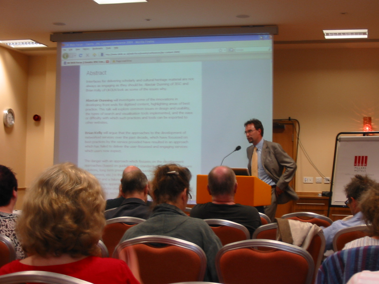 To answer these, he took lots of examples of projects over the last 10-15 years, starting in the early days of the web with the Gertrude Bell archive (“not the funkiest interface in the world”) and the Funeral Monument Census (described as “not the sexiest”!).
However, we’ve come a long way since then. Alastair made the point that graphic design has improved considerably, pointing us towards the Code Sinaiticus (an “engaging interface” even if you’re not a professional academic), and the Cartoon Archive at the University of Kent.
Are we being innovative enough?
Even though graphic design has improved, it’s often difficult to appreciate the content – you’re distracted by too many clicks or don’t understand how the search engine works. Some of the issues may seem trivial, but the user experience isn’t revealing the richness of collections.
Problems included:
- search box grammar, and inconsistent results
- understanding the collections – there’s often no real indication of content, and sometimes it’s even hard to tell from the name of the site!
- fiddly/complicated advanced searches, which are offputting
So where does it well? Alastair thought Christie’s (the auctioneers) was a good example. Their searches can be filtered by cost, or via artist/maker/author or via paintings/drawings etc, and it’s very accessible. They’re a good example of faceted browsing, where you structure your metadata using control fields. Pre-generated searches are done according to specific categories, allowing much more textual representation of content – and importantly it can be done all on one page. It’s very usable, and by pointing and clicking you can sift through an entire collection quickly.
Other good examples were the Flamenco Project at Berkeley University and the Comedie-Francaise Registers Project. Map-based searching is also a very good way of doing this (Alastair mentioned the
Usability
However, there’s a broader lack of skills with usability. When do we do testing (at the beginning/middle or end of a project?). Who does it – do we have the expertise, and are there institution-wide experts?
Sustainability
There’s also a sustainability problem. Good interfaces are continuously tweaked over time (for example the British Library Archival Sound Recordings – they have done usability testing, and updated according to user demand).
An even better example is BBC iPlayer – this has changed enormously over the last two years, and although it’s now more complex, it’s even easier to find the content after lots of tiny tweaks.
Summary
Alastair summed up by saying that we needed to think about
- innovating more
- structuring metadata
- embedding usability meaningfully
- sustainability
How do we deliver our innovation?
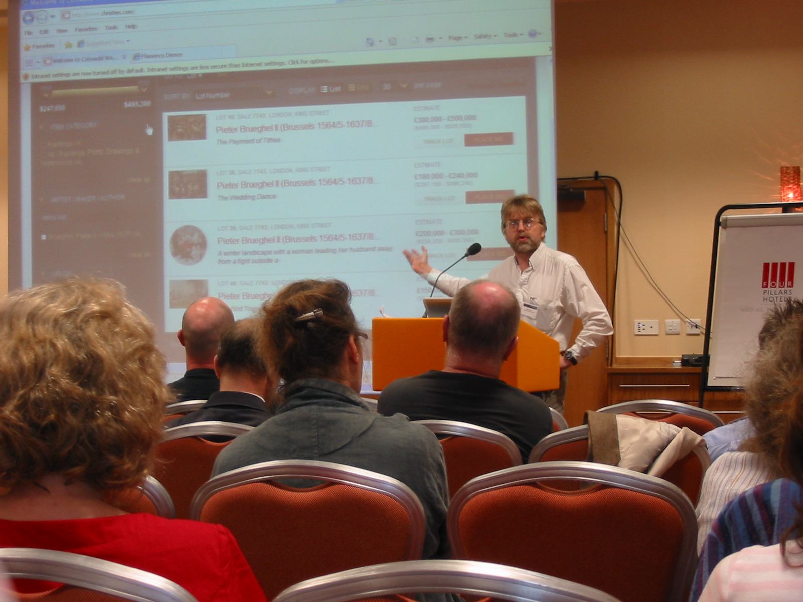 Brian Kelly gave a whistle-stop tour of the issues behind how we deliver our innovation.
He touched on past approaches – the focus on the back end processes (for example ATHENS, e-frameworks and SUMS), and how this has moved towards application services. All this was put in the context of the commercialisation of services, a mixed economy and the influence of Google on new business models.
He then proceeded to focus in on web 2.0, reminding us that to be really successful you need to build a global community (out of 100 users, 90 are lurkers, 9 participate from time to time, and 1 is really active).
This makes it difficult to get widespread impact within our own institution or the UK for a particular application. Are we better off looking to third-party providers? A good study is the paper on Building an Online Community at the Brooklyn Museum at Museums & Web 2007 conference, which described the use of flickr, myspace etc by the Brooklyn Museum.
But although in some areas institutions shouldn’t attempt to compete with existing successful tools (eg Goole), there are some problems – what happens if a third party provider goes out of business? Risk assessment is needed. If you are going to go down the in-house development route, some things to consider are:
- is it really a good time to be asking for more IT money?
- are projects sustainable?
- can we expect to compete?
Another problem is that we focus on the rules (eg you wouldn’t develop the Christie’s site because the URL conventions break the rules), and you may find innovation breaks the rules. He suggested that what we needed was to develop a framework (for example the JISC critical friends approach). We need to think about intended purposes, benefits, risks, missed opportunities (if we don’t do it, who will?), costs (what happens if Twitter disappears tomorrow?), and then ask all this within the context of a particular service.
Breakout!
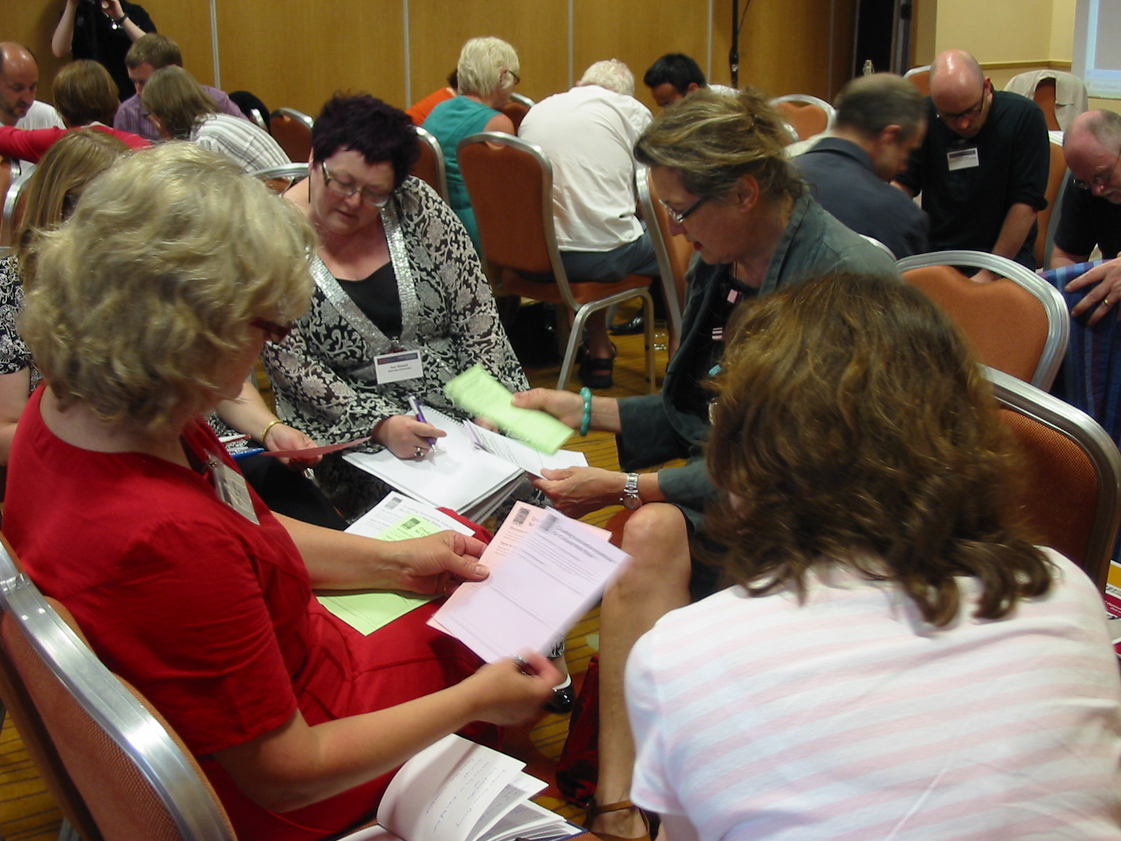 The room then broke into 6 groups, which were invited to look at one of the following areas:
- external hosting (for example using Amazon)
- social networks
- innovative interfaces
- embedding usability
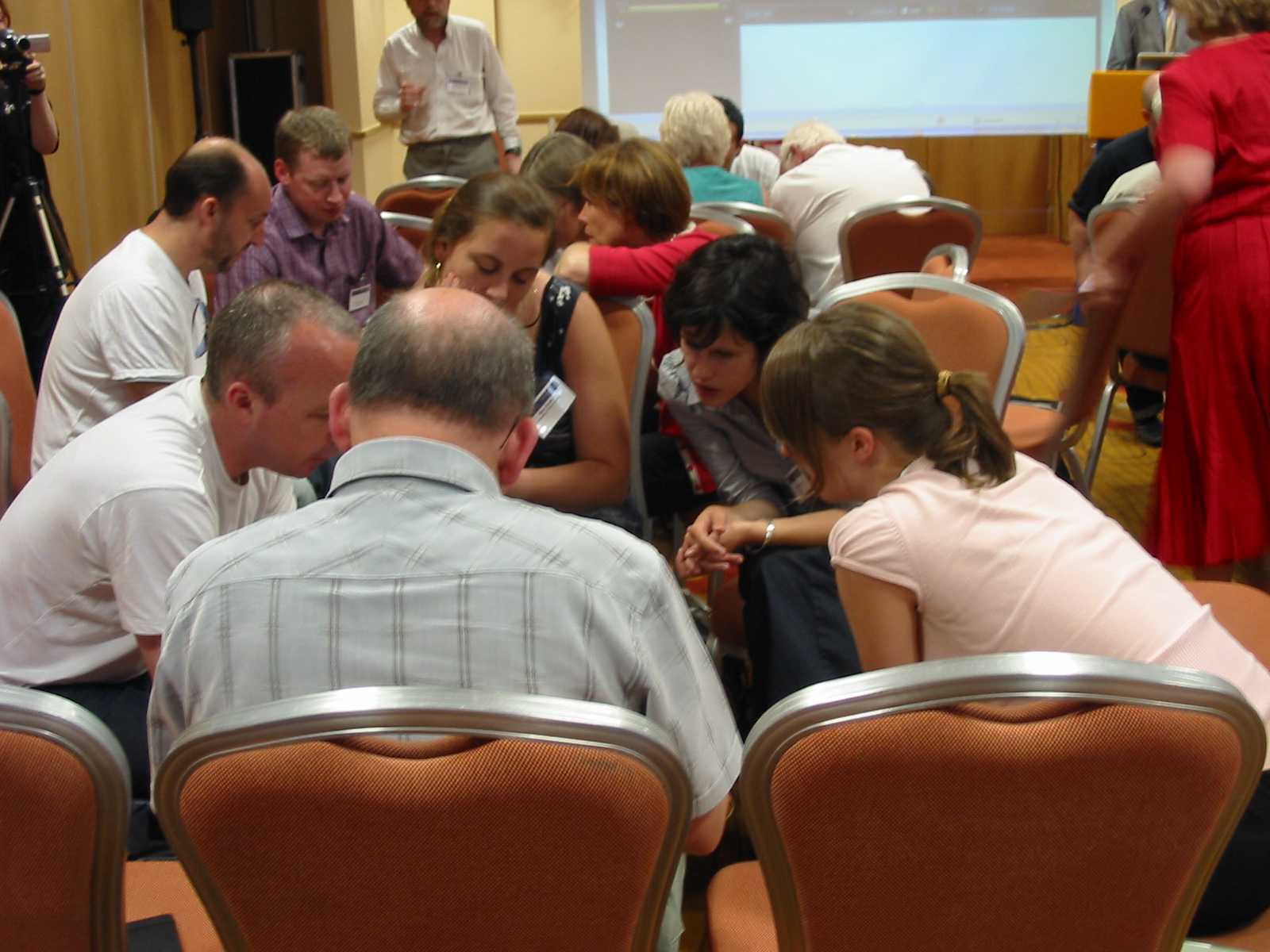
In fact, out of the six groups, four looked at social networking. Lively discussion followed – there were lots of animated conversations, and definitely ‘engaged’ users!
Use of social networking environments
Pros included:
- getting an ‘outside-in’ viewpoint
- can capture enthusiasm/streedcred – and it’s a good way of reaching students/users via the channels they’re using already
- overcoming fear of IT
- institutional business case – sustainability and feedback
- good searchability (other tools are already linked)
- you can reuse content across a number of services
- can drive traffic to your website, and increasing access to your services, and is useful as a marketing tool
- reciprocal linking
- as a tool for building user communities – couldn’t do it within your own institution
- a softer, more informal approach to learning – fool them into learning while having fun
- equality of status between old professor and new student!
- easy feedback mechanisms
- easy to keep people updated
- lure to get people to explore content more deeply – these environments can be quite immersive
- useful for media convergence – images/media/text together
- ‘stylish and fun’
Negatives:
- sustainability
- content creation – you have to be creating content that appeals to people and refresh it!! if there isn’t a clear purpose – and audience expectations may be too high?
- reputation management
- information overload – things can get buried under deluge, and is it a distraction (eg Twitter)
- lack of control over hosting services – what happens if it goes bust?
- privacy rights/who owns content?
- user fickleness – today’s facebook might be something completely different in two years’ time – permanence?
- lack of rules of etiquette
- not everyone has equal access
- some content isn’t suitable to be hosted externally – can’t always customise external services
- opportunity costs – time that you could spend developing your content elsewhere
- quality
- version control
- people may not want to combine their personal/work lives in this way
 A couple of points to draw out from this were that there is a training issue – can people be made aware of appropriateness of different tools for different jobs? Is using social media relevant to what you’re trying to achieve – don’t just use it because it’s there!
Innovative technologies
Some of these include:
- Twitter (which encourages people to talk to each other, makes them think about what they want to say),
- cross-searching databases
- iTunesU – opens up university lectures to anyone
- e-books (save space!)
- use of mobile devices/learning for people travelling or learning
- interfaces
However, there are barriers. These include:
- copyright
- ownership
- “brand going down the tubes”
- non-interoperability (don’t always have money/skills)
- quality control
- defamatory remarks
- IT services bolt things down – some instituitions don’t allow students to use Facebook, for example
Embedding usability
The constrictions of VLE were discussed, and the benefits of open source and collaborative development (Moodle vs Blackboard). Other benefits include:
- interactive for both creator and user
- web-based tools – (PebblePad) used in different ways according to experience
As with the other topics, there were concerns:
- for a lot of institutions there’s no choice
- if you can use these innovative interfaces they’re external – what happens if they fail?
- accessibility and metadata chaos
- corporate image
- people wasting time
